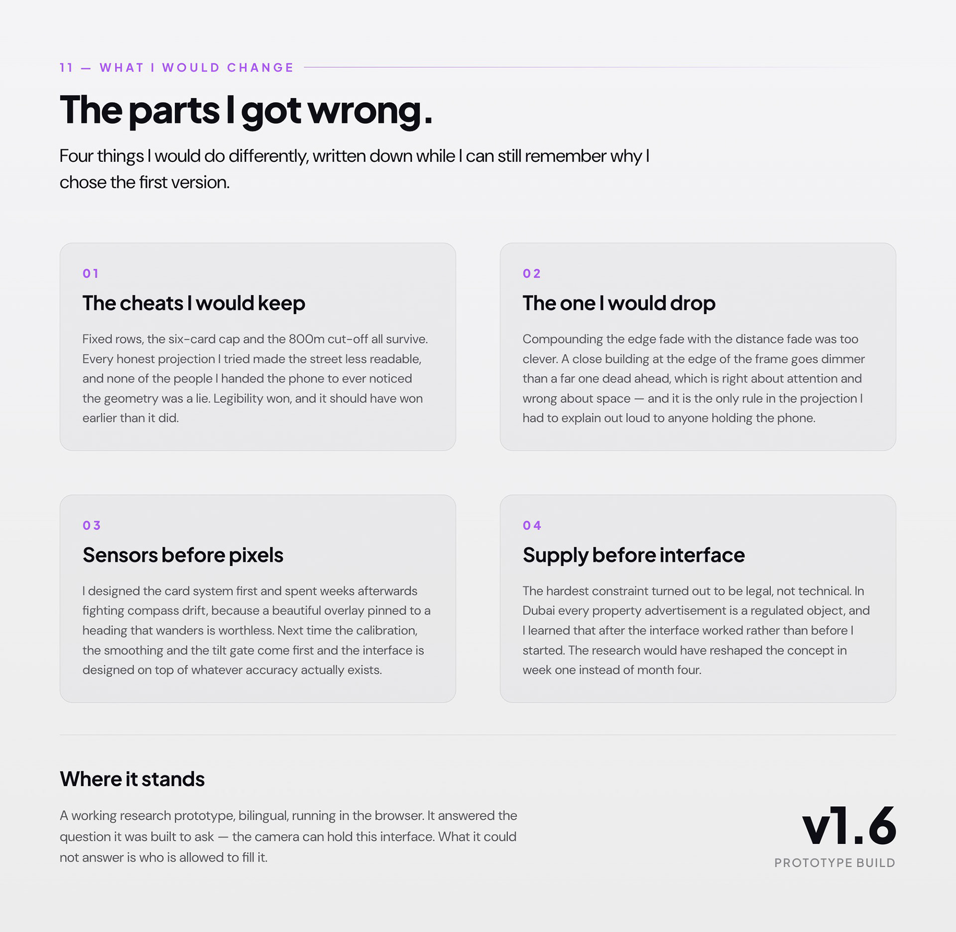
Building View — a self-initiated AR prototype
BUVU is short for Building View, and the name is the whole idea: you find a home by looking at the building it is in. Point your camera down a street in Dubai and the homes for sale and rent inside those towers appear where they actually are — on the buildings, at the right distance, in the direction you are facing. It is designed as a phone app. What I built and tested is a prototype running in a mobile browser, because that was the fastest way to get it onto a real street. I designed the interface, drew the mark, wrote the voice, and built it.
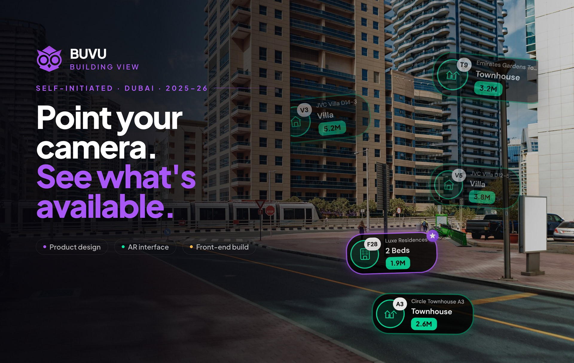
Every property app is the same three screens
Everything I built was an attempt to test one line I wrote in the first week, and to find out whether it was true or just a nice sentence. The honest answer is that the existing apps are not bad products — they are complete, fast and well-made. They just ask you to do the translation work, from a grid of photographs into a place, and then leave you to find out on site whether you were right.
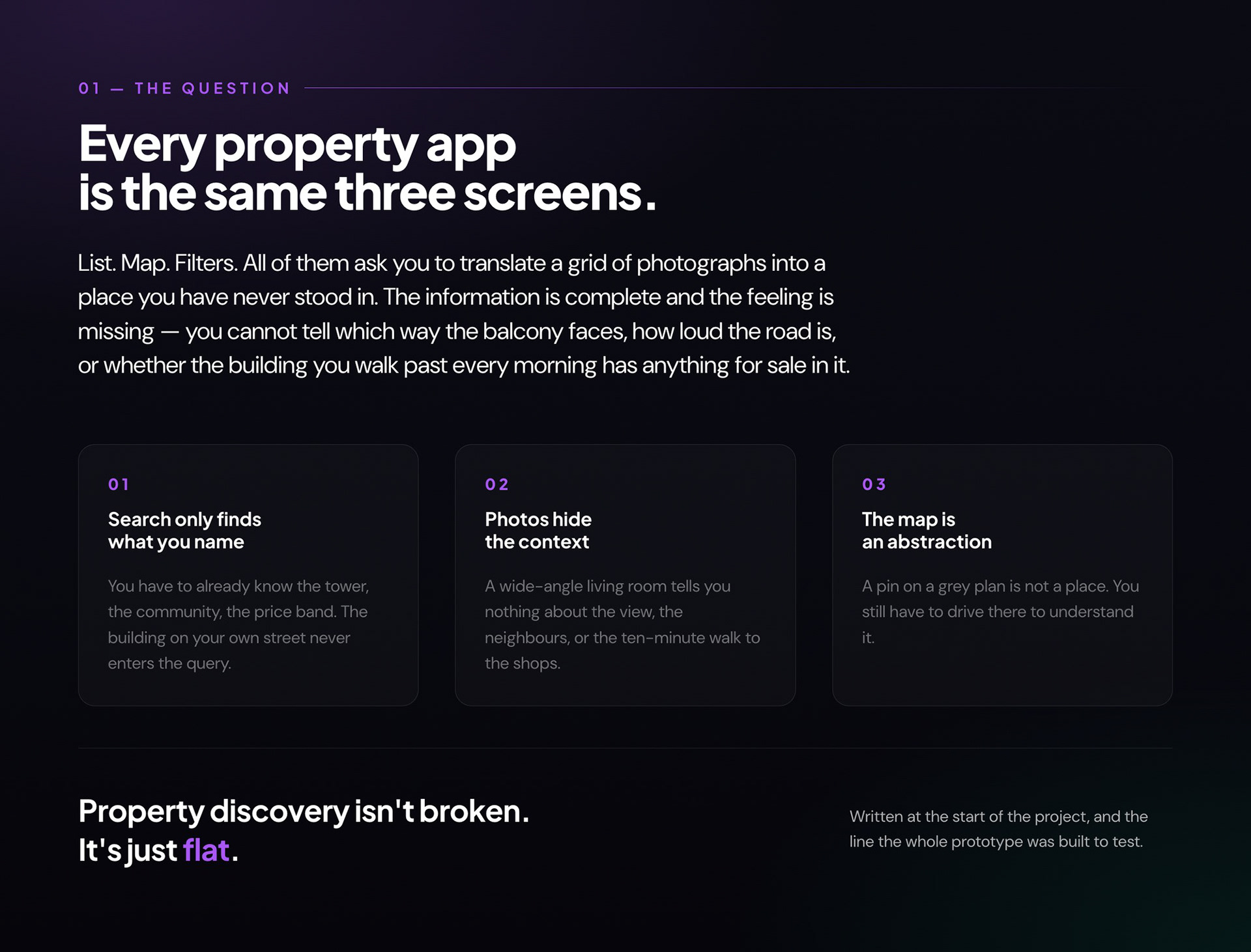
Open. Allow. Look up.
BUVU is meant to be an app. I prototyped it in a mobile browser for one reason: a question like "does this read while you are standing in front of the building" cannot be answered at a desk, and the browser let me hand a URL to whoever was next to me on the pavement and watch them use it two minutes later. The cost is real — no ARKit, no plane detection, no persistent anchors, and a motion-permission prompt on iOS that no amount of design fully hides. For testing the idea, none of that mattered. For shipping it, all of it does.
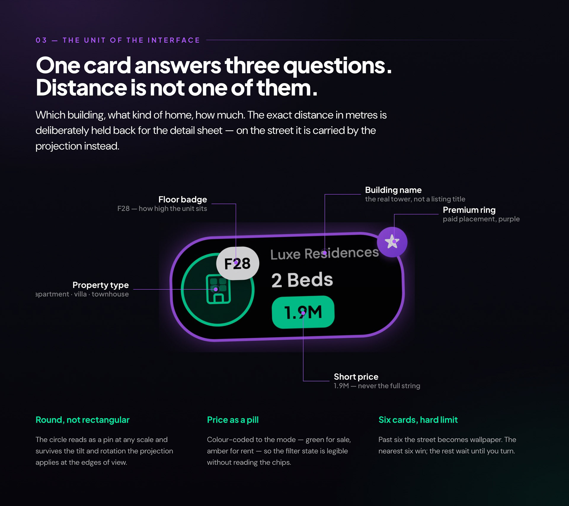
One card answers three questions
Deciding what a card is not allowed to say took longer than designing it. Early versions carried distance, agent name, a photo thumbnail and a save button, and at six cards on screen the street disappeared behind its own interface. Stripping it back to building, type and price — and moving distance out entirely — is what made the overlay feel like an annotation on the world rather than a list floating in front of it.
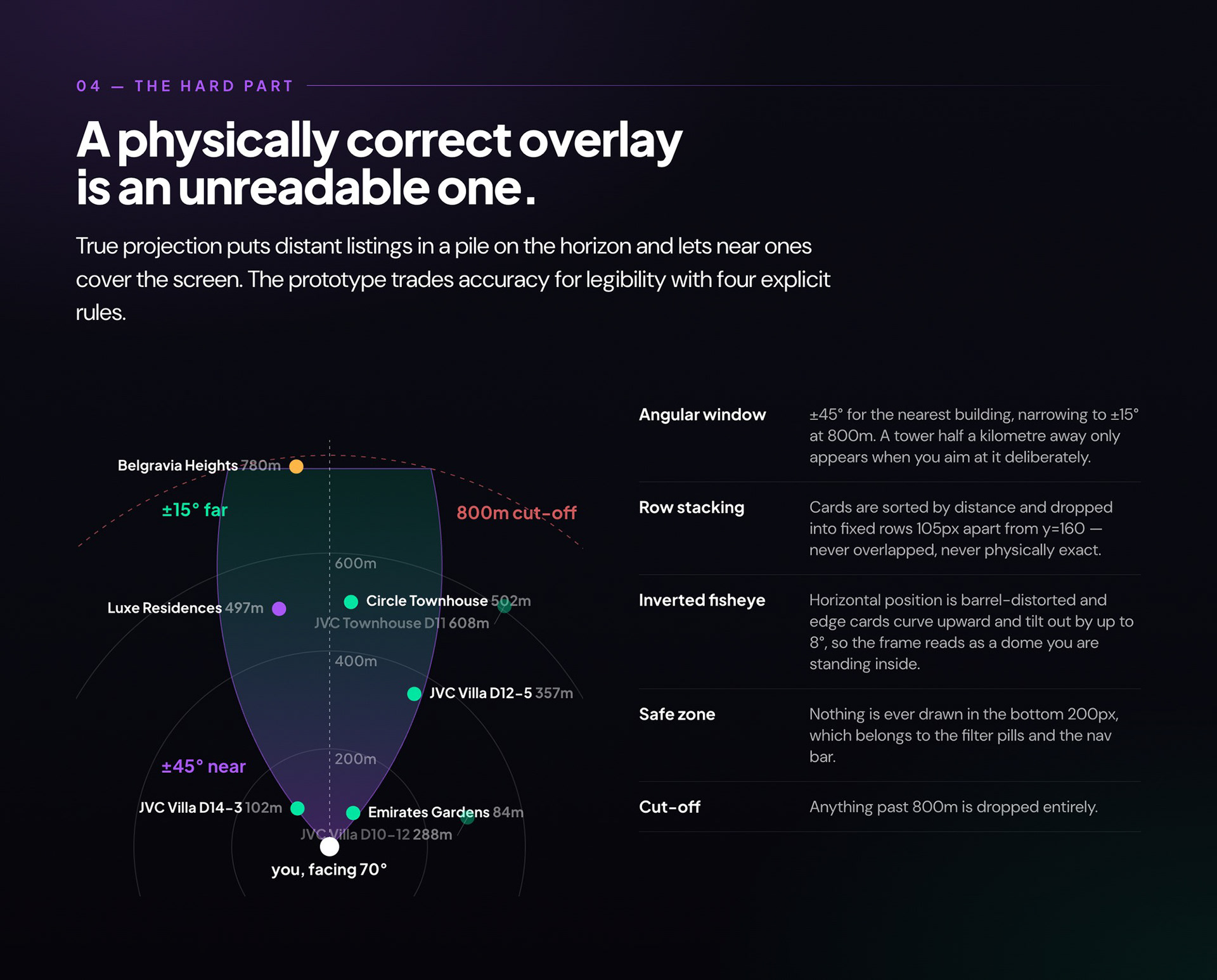
A physically correct overlay is an unreadable one
This is the part I would talk about in an interview. Getting listings to sit in the right place is trigonometry and takes an afternoon; getting them to be readable is the actual design problem, and it took weeks. Every honest projection I tried made the street worse — distant listings piled on the horizon, near ones swallowed the screen, and any two buildings at a similar bearing produced an unreadable stack. What shipped is a set of deliberate lies, each one written down as a rule so I could argue with it later.
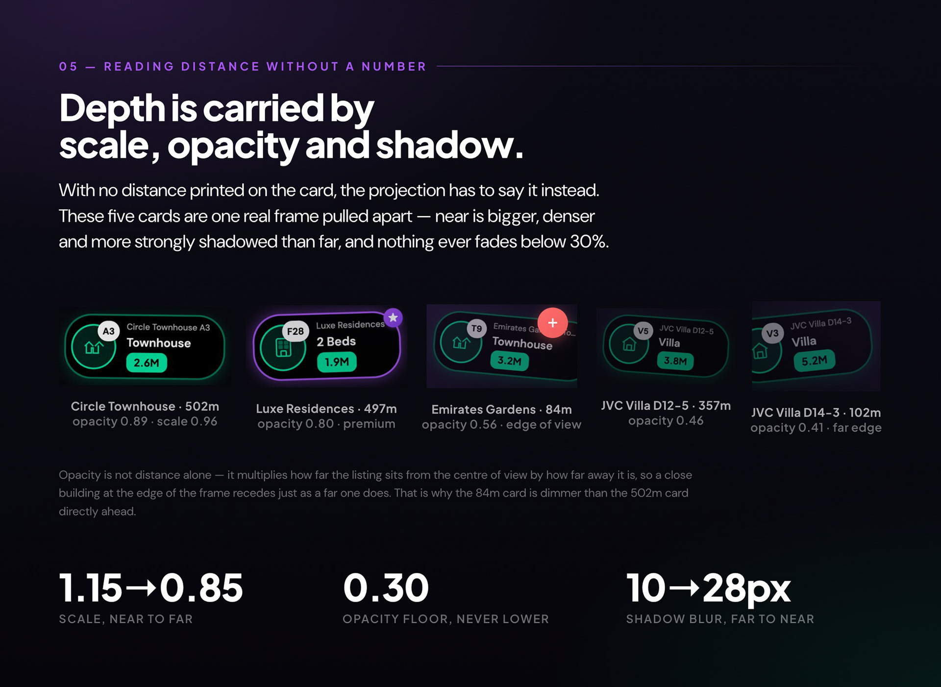
Scale, opacity and shadow carry the distance
Because the card refuses to print a distance, the projection has to communicate it some other way, and the interesting detail is that the fade is not distance alone — it compounds distance with how far the listing sits from the centre of your view. A building 84 metres away at the edge of the frame reads as dimmer than one half a kilometre away straight ahead. That is wrong as physics and right as attention: it tells you what you are pointing at.
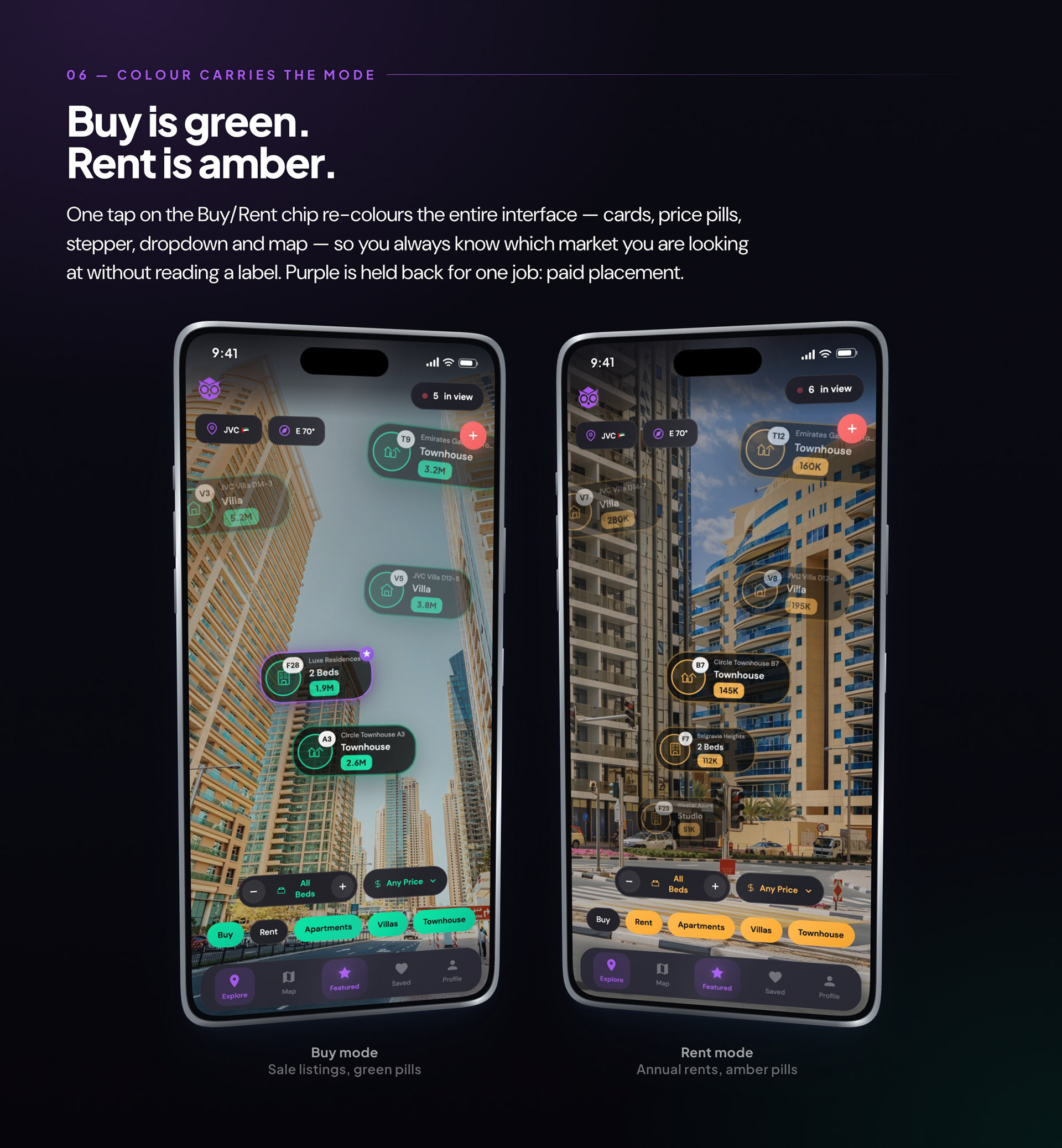
Buy is green, rent is amber, paid placement is purple
Colour is doing state, not decoration. The whole interface re-tints on the Buy/Rent switch, which means a screenshot of the app tells you which market you were looking at without a single label — useful when the same street contains both. Purple is held back for one job only: paid placement, the single thing in the product that anyone would ever be charged for. Reserving the brand colour for the commercial mechanic was a way of keeping myself honest about where the money would come from.
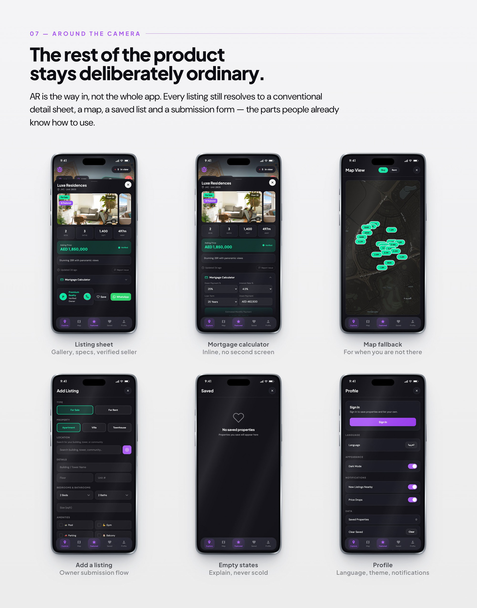
AR is the way in, not the whole app
There is a temptation with an AR product to make everything spatial. I deliberately didn't. Once you have tapped a card you want a gallery, a floor number, a price, a calculator and a way to phone someone — and all of those are solved problems that people already know how to operate. Keeping the second layer boring is what earns the first layer its strangeness.
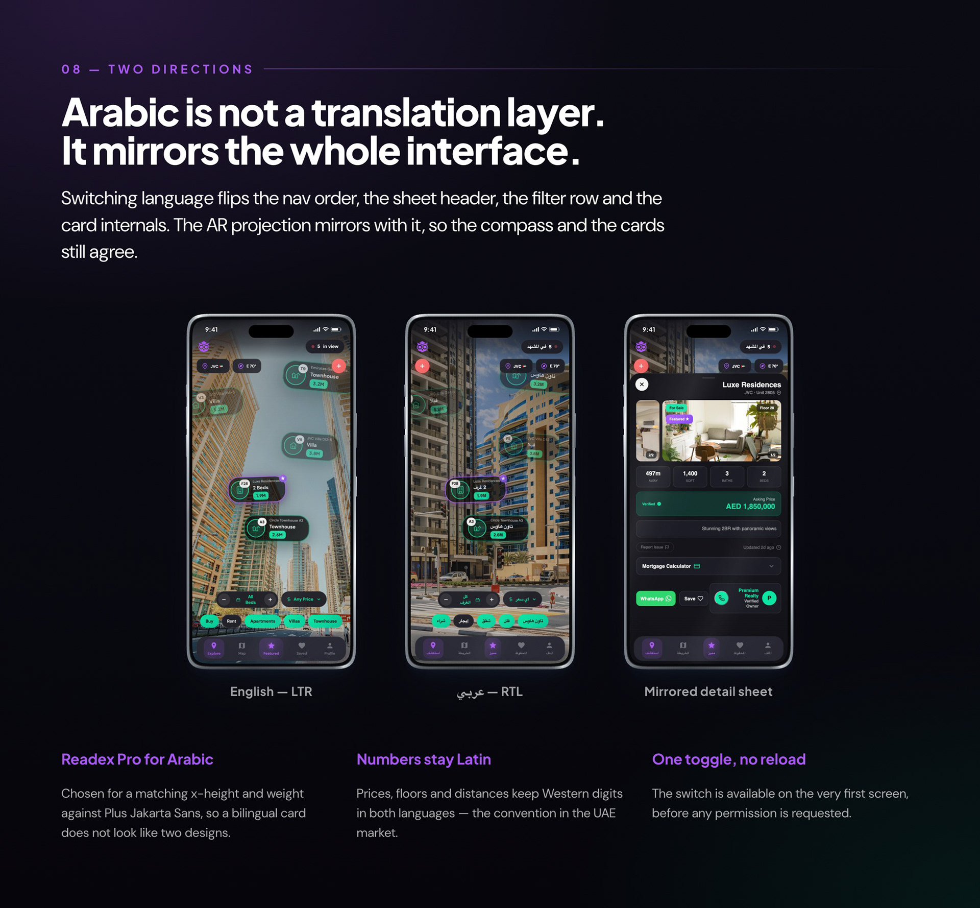
Arabic is not a translation layer
Arabic was in from the first build rather than retrofitted, which changed decisions rather than just strings. The AR projection had to mirror alongside the layout so the compass and the cards continued to agree, and the type had to be chosen as a pair — Readex Pro against Plus Jakarta Sans — so a bilingual card reads as one design and not two stitched together. Numerals stay Latin in both languages, which is what the UAE market actually does.
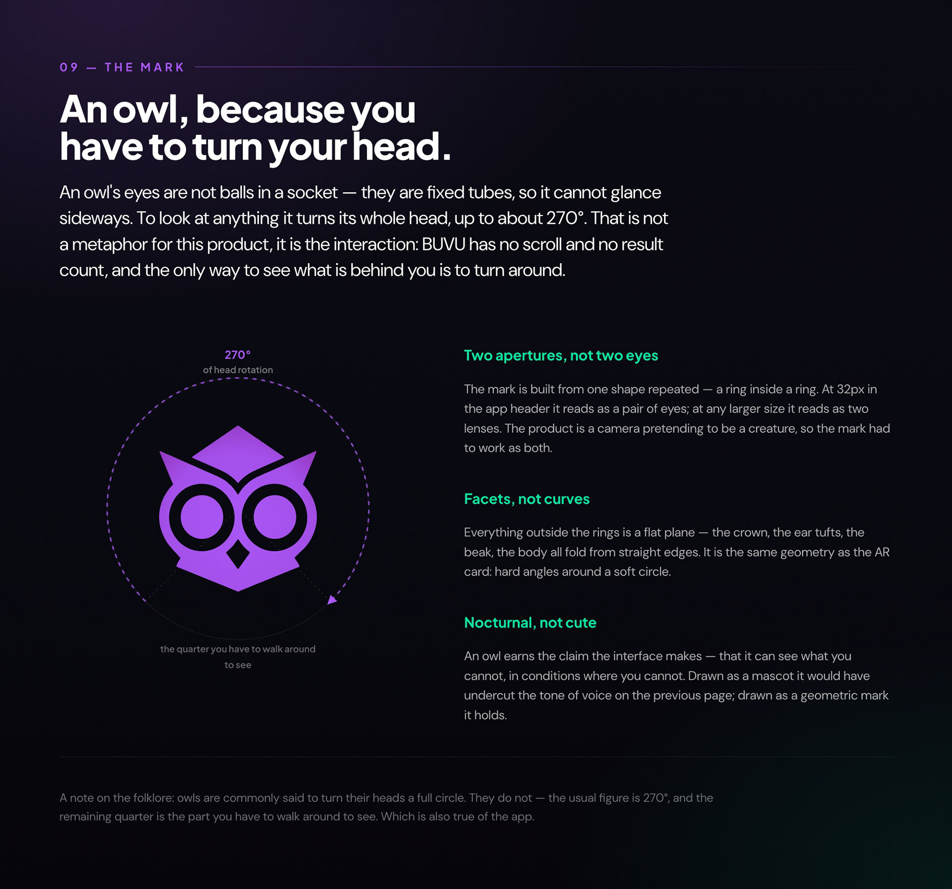
An owl, because you have to turn your head
The logo is the one piece of the project that argues for the whole idea. An owl's eyes are not balls in a socket, they are fixed tubes — it physically cannot glance sideways, so to look at anything it turns its entire head, up to about 270°. That is not a metaphor I applied afterwards; it is the interaction. BUVU has no scroll, no results count and no way to skim: the only way to see what is behind you is to turn around. The mark is drawn as two rings inside two rings, so at 32px in the app header it reads as a pair of eyes and at any larger size it reads as a pair of lenses — the product is a camera pretending to be a creature, and the mark had to work as both. Everything outside the rings is a flat plane, the same hard-angled geometry as the AR card. And for the record, owls do not turn a full circle; the usual figure is 270°, and the missing quarter is the part you have to walk around to see. Which is also true of the app.
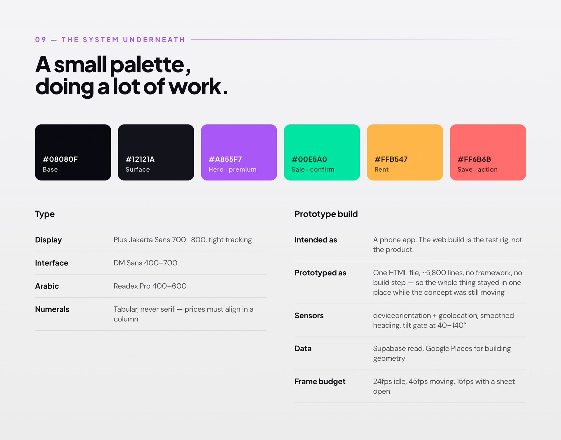
A small palette, doing a lot of work
One file, no framework, no build step — a constraint I set on purpose so the whole prototype stayed in one place while the concept was still moving. It is a test rig and I would not build the real thing this way. The frame budget was the part I underestimated: an AR view that flattens a battery is a demo nobody finishes, so the render loop throttles itself depending on whether you are moving and whether a sheet is open.
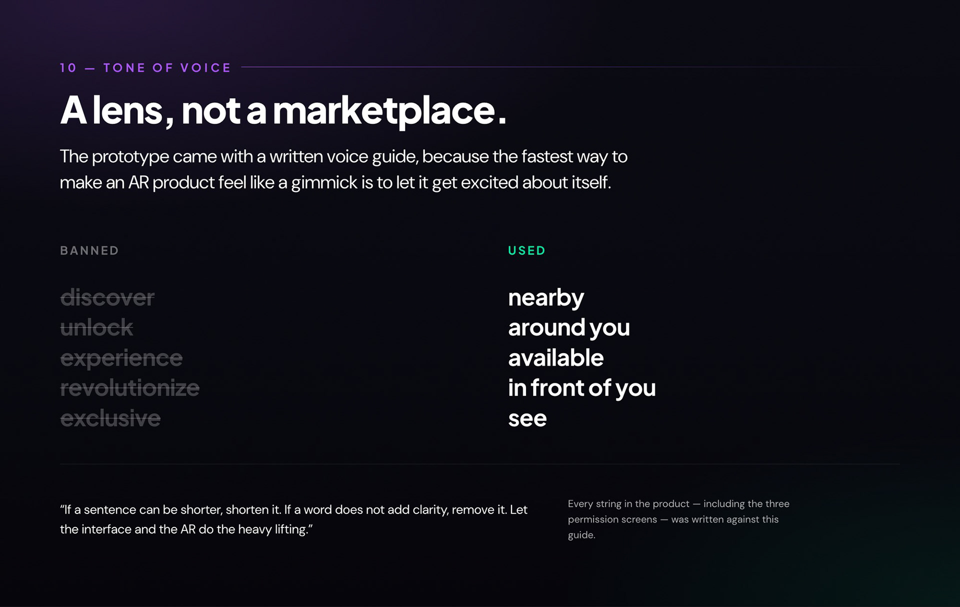
A lens, not a marketplace
I wrote the voice guide before most of the interface, which turned out to be the cheapest quality control in the project. Once discover, unlock and exclusive were banned outright, whole categories of bad screen disappeared on their own — you cannot write a hype-driven empty state with that vocabulary. It also settled arguments quickly, because the question stopped being whether a line was good and became whether it obeyed the rule.
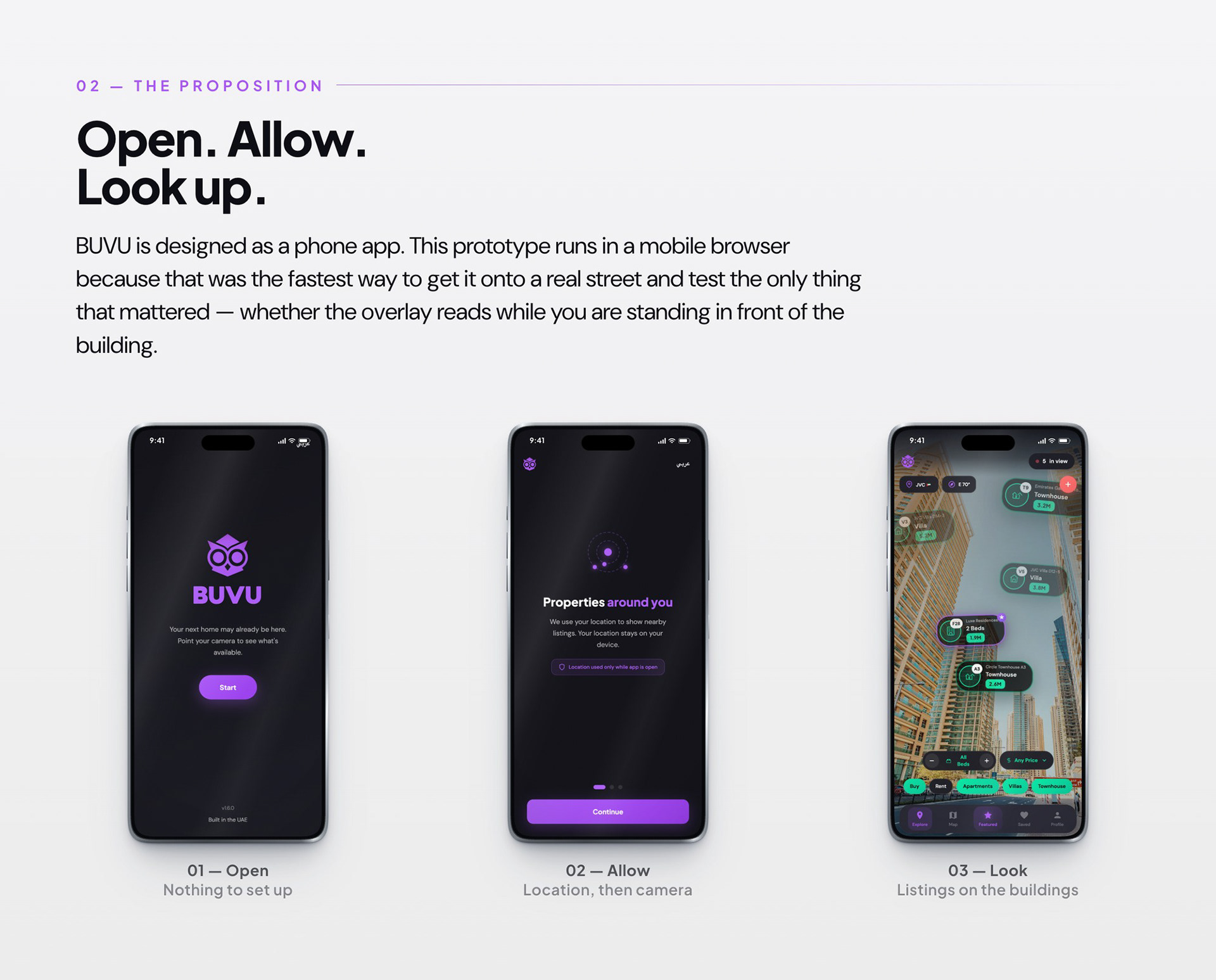
The parts I got wrong
Four things I would do differently. The cheats in the projection I would keep — fixed rows, the six-card cap, the hard cut-off — because legibility won every time, and nobody I handed the phone to ever noticed the geometry was a lie. The one I would drop is compounding the edge fade with the distance fade: it is right about attention and wrong about space, and it is the only rule in the whole projection I ever had to explain out loud. I would do the sensor work before the pixels, because a beautiful overlay pinned to a heading that wanders is worthless, and compass drift decided whether this felt real far more than any visual decision did. And I would have researched supply before interface — in Dubai every property advertisement is a regulated object, and learning that after the interface already worked cost me the chance to let it reshape the concept in week one instead of month four.