Product design · AR interface · Front-end build · 2025-26 · Working prototype, v1.6.0
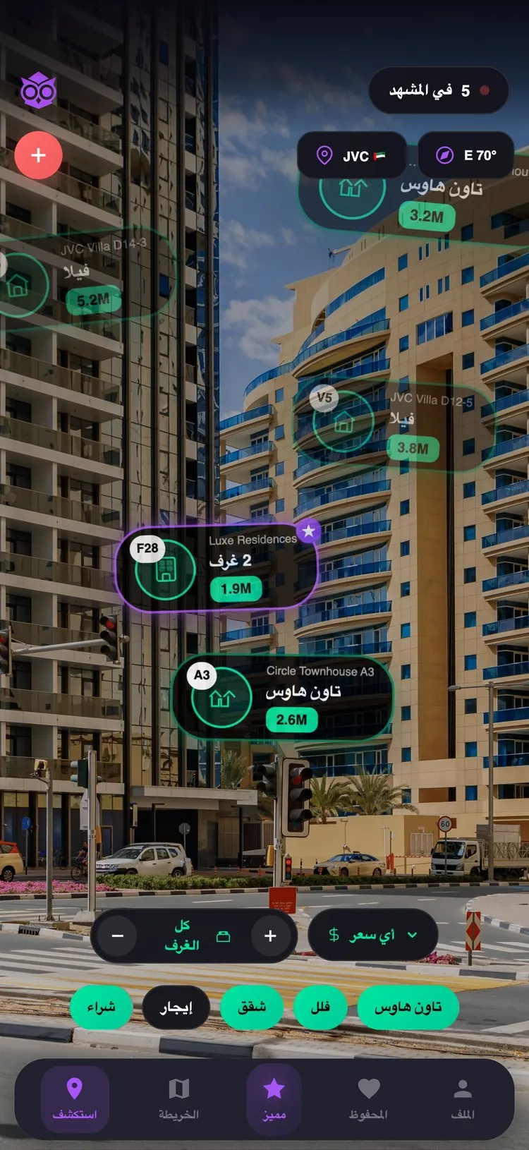
BUVU is short for Building View. You find a home by looking at the building it is in. Point your camera down a Dubai street and the homes for sale and rent appear on the towers that hold them.
It is designed as a phone app. What I tested is a prototype running in a mobile browser. I designed the interface, drew the mark, wrote the voice, and built it.
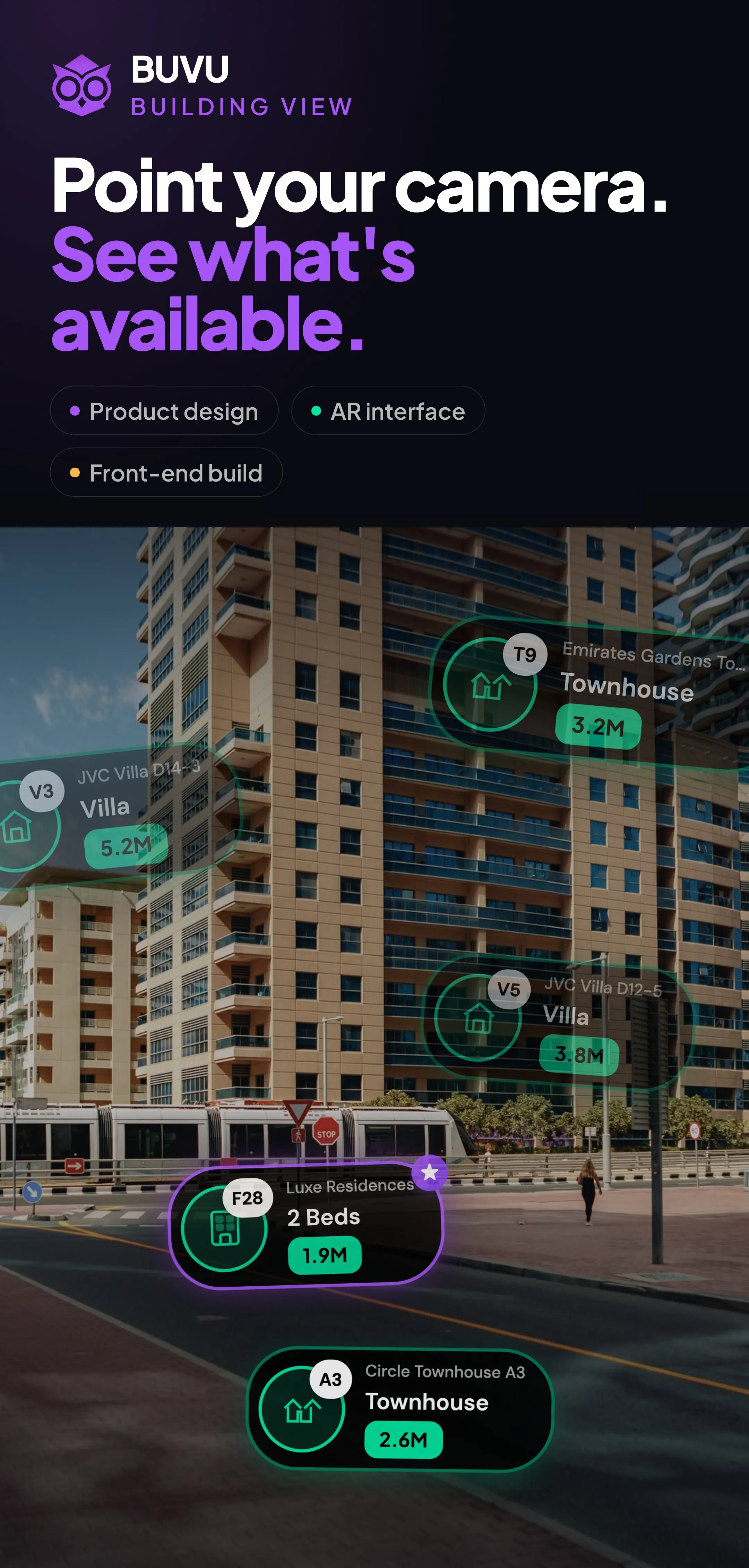
Every property app is the same three screens
The existing apps are not bad products: complete, fast, well made. They just hand you the translation work, from a grid of photographs into a real place. Then you go to the building to find out whether you were right.
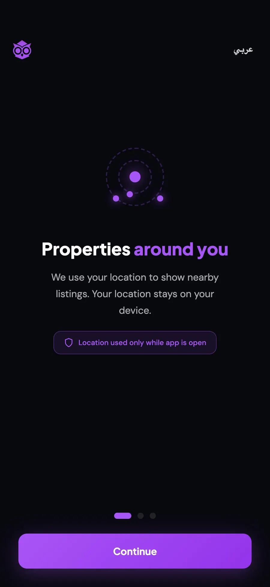
Open. Allow. Look up.
Whether the overlay reads in the street cannot be settled at a desk. The browser let me hand a URL to whoever was on the pavement and watch them use it.
The cost: no ARKit, no plane detection, no persistent anchors, an iOS motion prompt. For testing the idea, none of that mattered. For shipping it, all of it does.

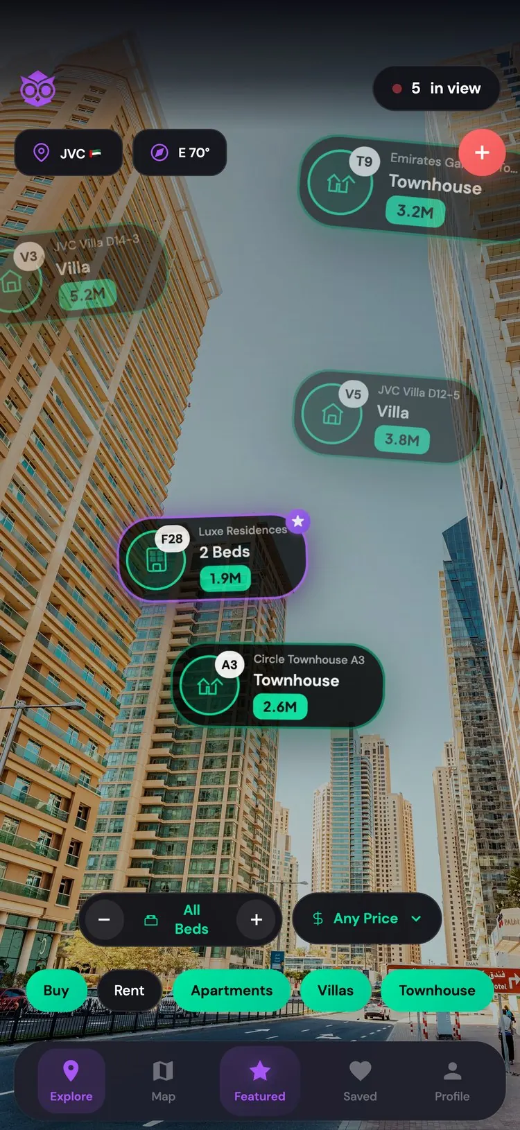
One card answers three questions
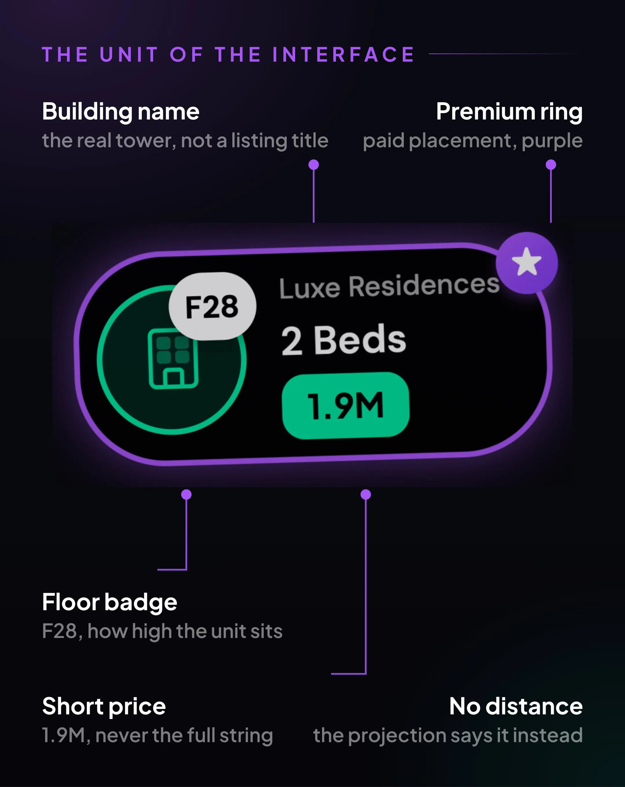
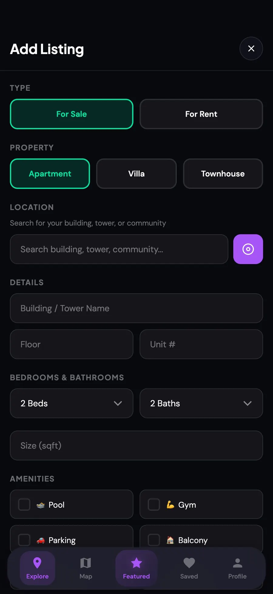
Deciding what a card is not allowed to say took longer than designing it. Early versions carried distance, an agent name, a thumbnail and a save button. At six cards the street disappeared behind its own interface.
Stripping it to building, type and price turned the overlay into an annotation on the street.
The overlay lies on purpose
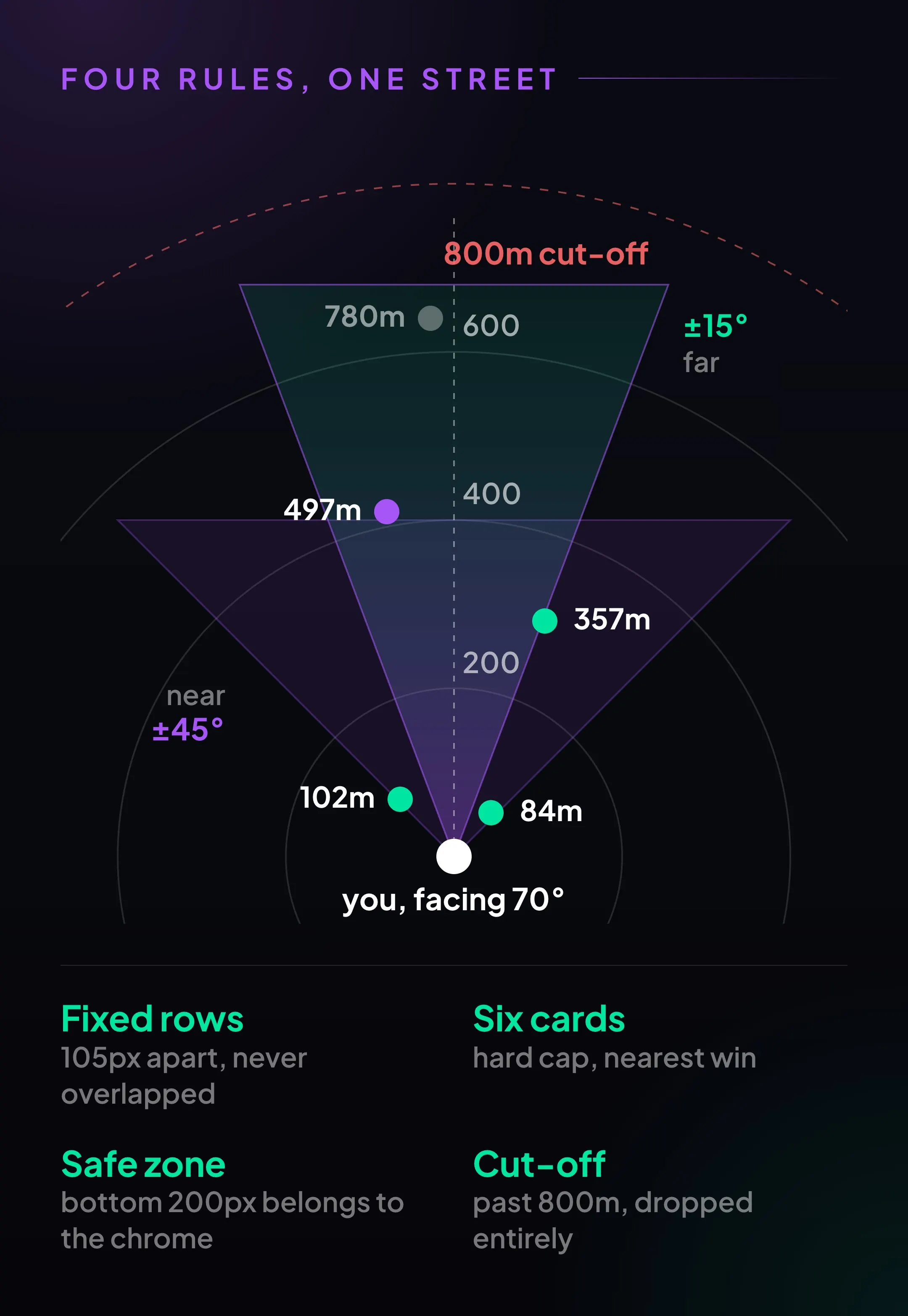
Putting listings in the right place is trigonometry and takes an afternoon. Making them readable took weeks. Every honest projection made the street worse: distant listings piled on the horizon, near ones swallowed the screen. What shipped is a set of deliberate lies, each one written down as a rule.
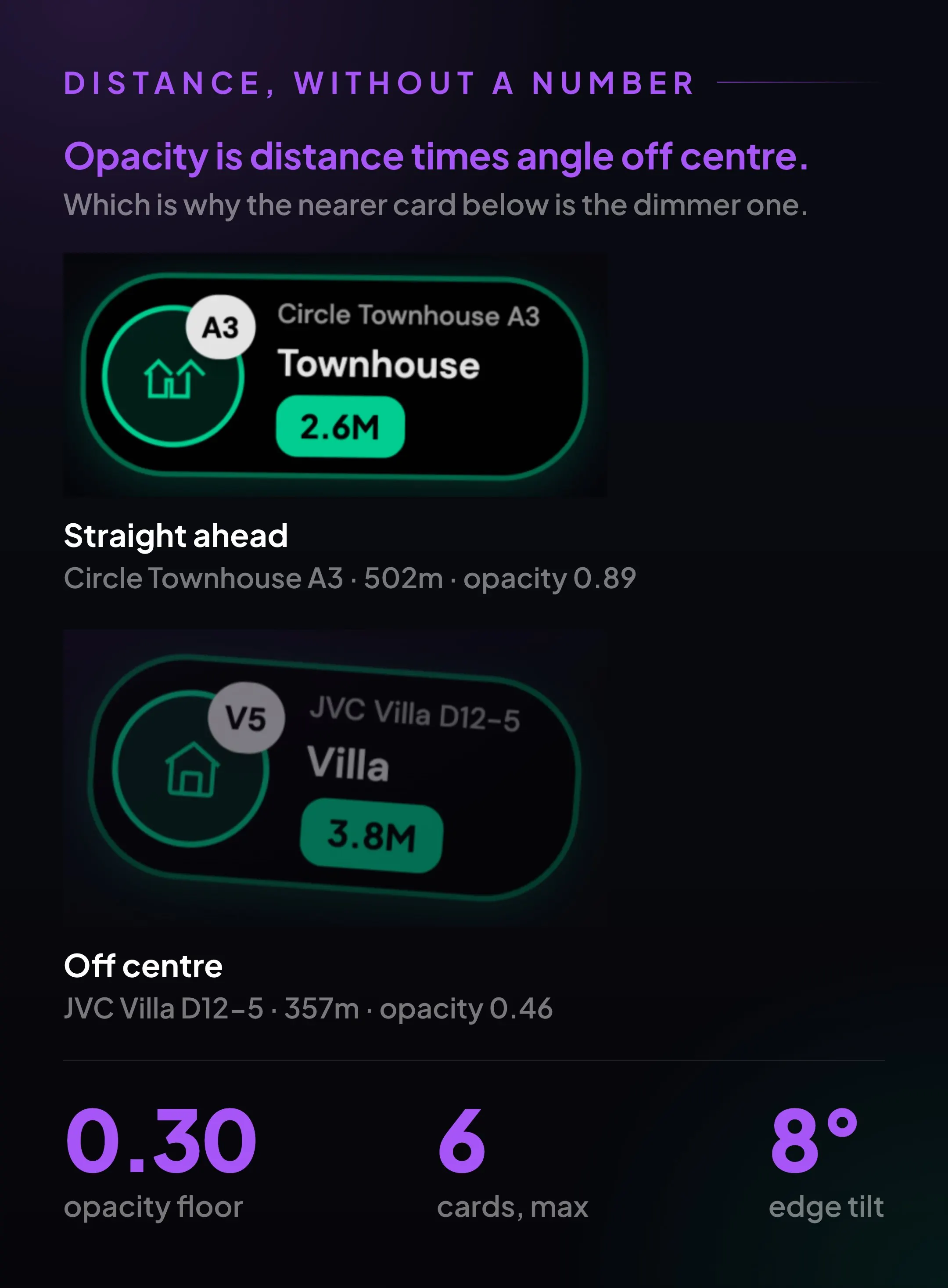
The card prints no distance, so scale, opacity and shadow carry it. The fade compounds distance with angle off centre. A building 84 metres away at the edge reads dimmer than one half a kilometre straight ahead. Wrong as physics, right as attention: it tells you what you are pointing at.
Buy is green, rent is amber
The whole interface re-tints on the switch. A screenshot tells you which market you were in without a single label, useful when one street holds both. Purple is held back for paid placement, the only thing anyone would pay for. Nothing else in the app is allowed to use it.
Everything after the tap is ordinary
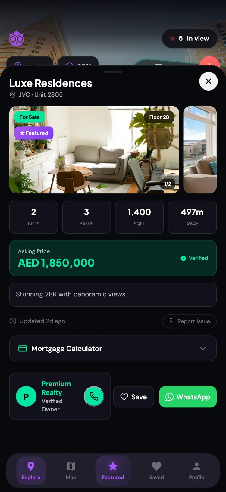
The temptation with AR is to make everything spatial. I did not. Tap a card and you get a gallery, a floor number, a price, a calculator and a way to phone someone. Keeping the second layer boring is what earns the first layer its strangeness.
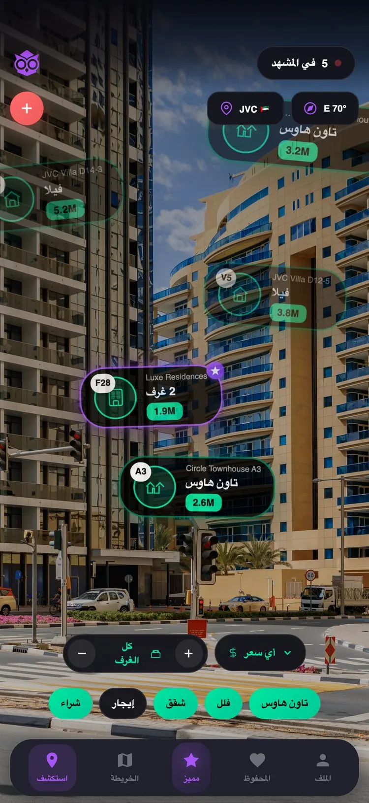
Arabic was in from the first build, so it changed decisions, not just strings. The projection mirrors alongside the layout so the compass and the cards keep agreeing. The type is a pair, Readex Pro against Plus Jakarta Sans, so a bilingual card reads as one design.
An owl, because you have to turn your head
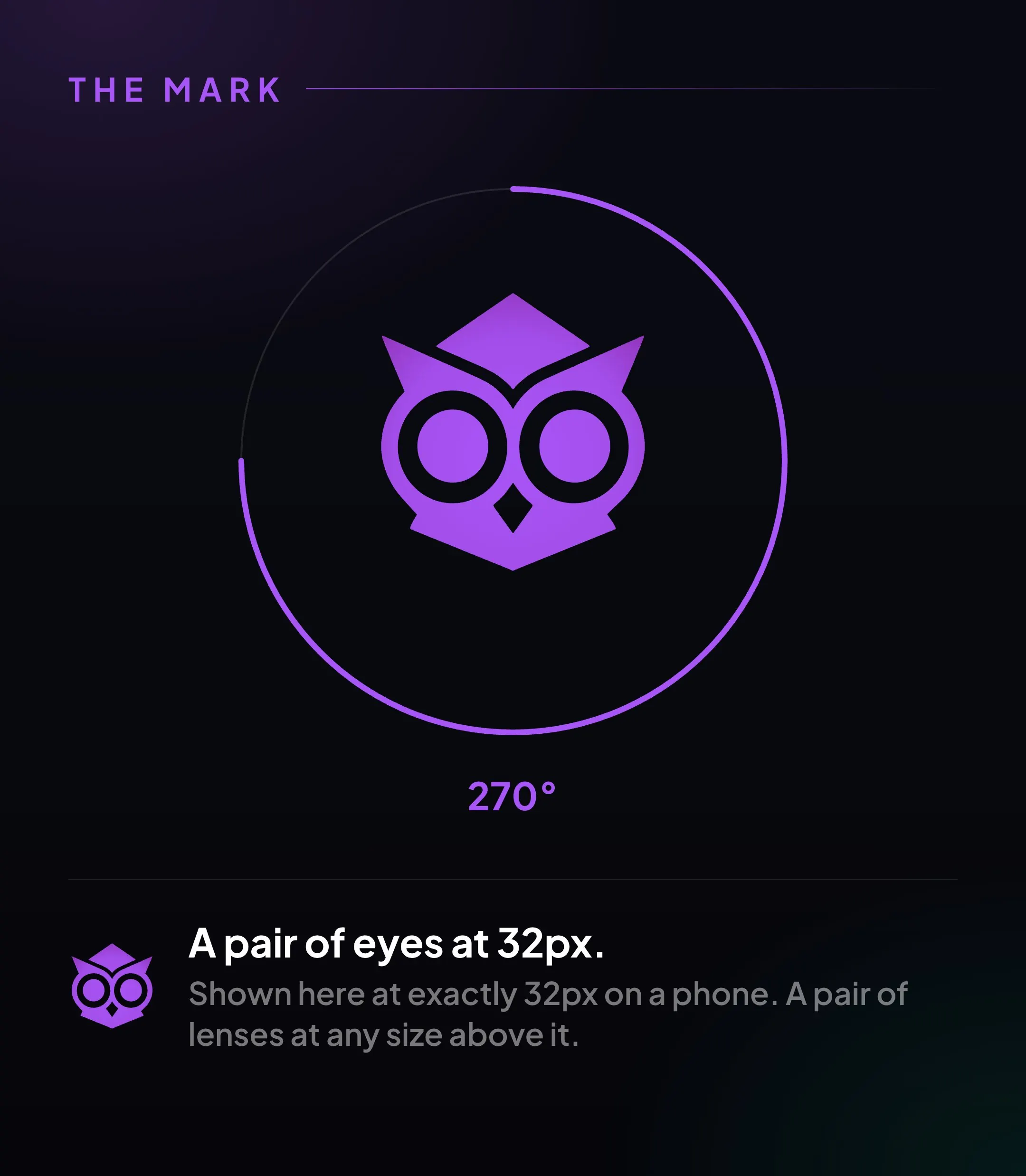
An owl's eyes are fixed tubes, not balls in a socket. It cannot glance sideways, so to look at anything it turns its whole head, up to about 270 degrees. That is the interaction, not a metaphor.
BUVU has no scroll, no results count and no way to skim. To see what is behind you, you turn around. The mark is two rings inside two rings: eyes at 32px, lenses at any larger size.
What I got wrong
The cheats I would keep: fixed rows, the six-card cap, the hard cut-off. Legibility won every time, and nobody I handed the phone to noticed the geometry was a lie. The one I would drop is compounding the edge fade with the distance fade. Right about attention, wrong about space, and the only rule in the projection I ever had to explain out loud.
I would do the sensor work before the pixels, because an overlay pinned to a wandering heading is worthless. And I would have researched supply before the interface. In Dubai every property advertisement is a regulated object, and I only learned that after the interface already worked.
BUVU, Building View.
The prototype is at buvu.app, best seen on a phone, outdoors.